Rebranding Moniker
Founded in 1999, Moniker is one of the internet’s most established registrars, trusted by domain investors worldwide for 🔒 security, 💸 competitive pricing, and access to 1,000+ TLDs. 📈 After its $65M acquisition by Oversee.net (2008) and later joining KeyDrive SA (now Team Internet Group), Moniker has held a defining place in the domain industry.
PROBLEM
When Moniker approached us, the brief was clear: their products had modernized, but their brand had not kept up. The challenge was to build an identity that matched their renewed ambition.
SOLUTION
Reassert Moniker’s presence with a bold, future-facing identity. Create a consistent visual system across ads, comms, website and social, anchored by a brand guide. Strengthen customer connection and recall in a crowded market.
SERVICES
Brand Audit
Competitor Audit
Brand Strategy
Brand Design
Brand Applications
Brand Guide
TEAM
Rigved Sathe (Strategy & Design)
Kemal Sanli (Illustrations)
Smith Kavishwar (Design Intern)
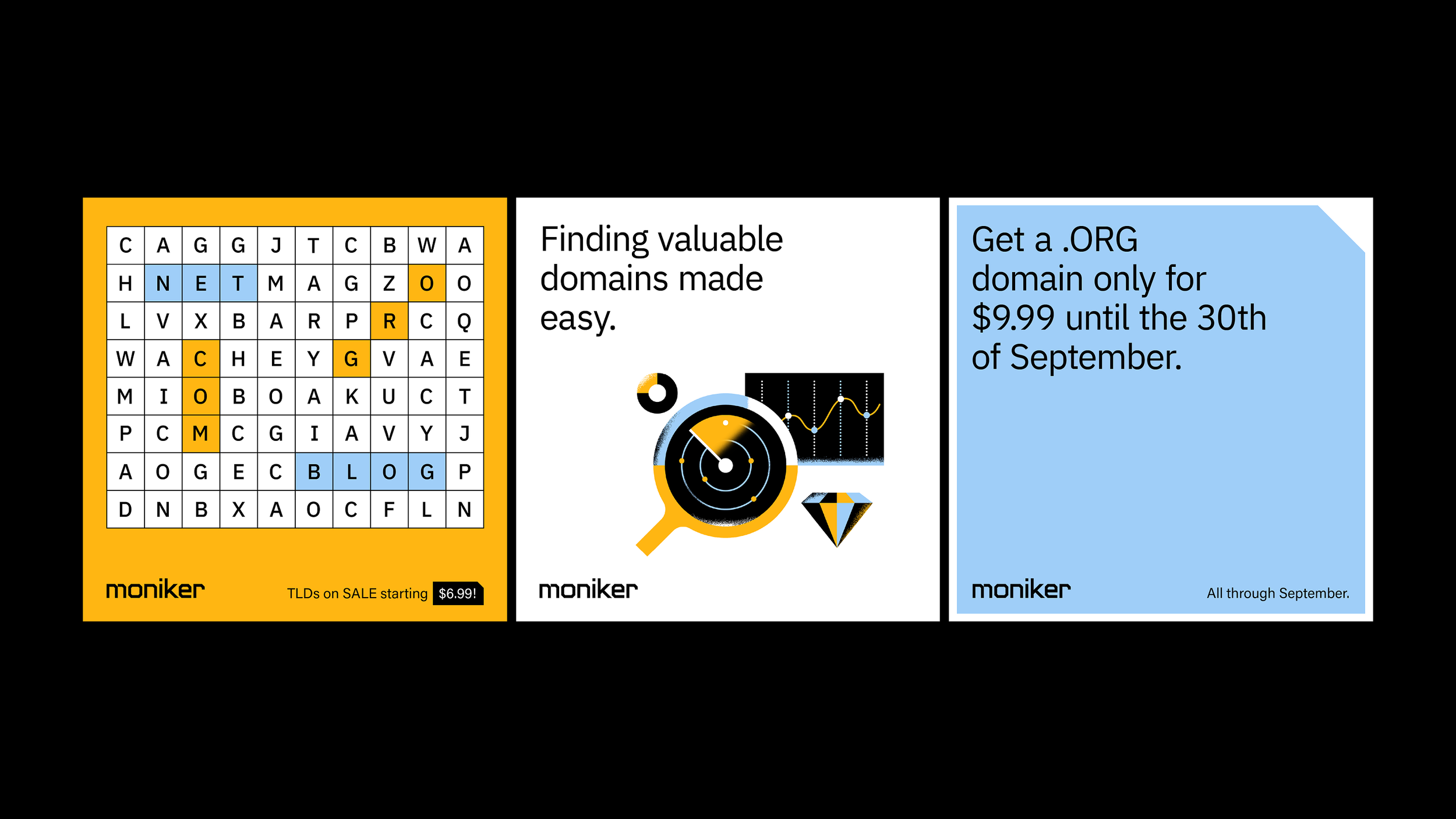
⚫⚪ Black and white foundation → timeless authority, a system serious investors can trust.
🟡🔵 Yellow and blue accents → energy, trust, modernity, making the brand feel inviting to those entering the space.
✏️ Geometric illustrations → transform complex domain concepts into clear, friendly narratives that welcome both seasoned pros and first-time users.