Helvetica —
Title Sequence
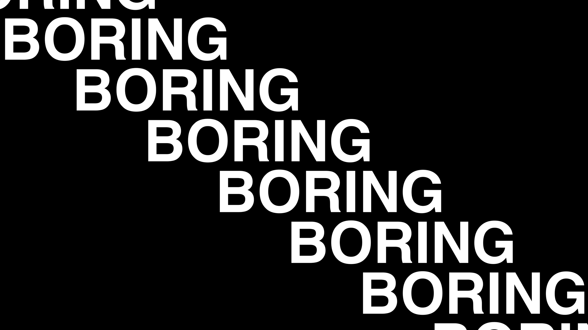
I drew inspiration from Gary Hustwit's documentary on Helvetica to create a title sequence for my Motion Media class at the Savannah College of Art and Design. My objective was to showcase the ubiquitous use of Helvetica, which permeates the realms of design, advertising, psychology, and communication.
I used design elements such as color, typography, and motion, to draw attention to the universality of the Helvetica typeface. The result is a visually impactful representation of the documentary that communicates its themes and message.
In summary, my project was a creative exploration of the Helvetica typeface and its widespread use. Through this project, I was able to showcase its versatility and timelessness while staying true to its Swiss heritage.


