Rebranding OnlyDomains
Founded in 2010, OnlyDomains is an online registrar designed to help freelancers and businesses get online. They offer domain names, web and email hosting solutions, and SSL certificates to 300,000+ customers. Based in Hawkes Bay, New Zealand, OnlyDomains is a part of the global CentralNic umbrella with team members spread in Napier, Melbourne, London, Mumbai, and Sankt Ingbert.
PROBLEM
OnlyDomains hadn't updated its brand identity in a decade. It didn't reflect its values and personality. With growing needs and unclear guidelines, it resulted in visual clutter and low brand recall among customers.
SOLUTION
We collaborated with OnlyDomains to create a new brand identity that makes the process of getting online fun and inclusive. We redesigned the logo, colours, illustrations and typography to reflect OnlyDomains as a friendly, smart and empathetic brand.
SERVICES
Brand Audit
Competitor Audit
Brand Strategy
Brand Design
Brand Applications
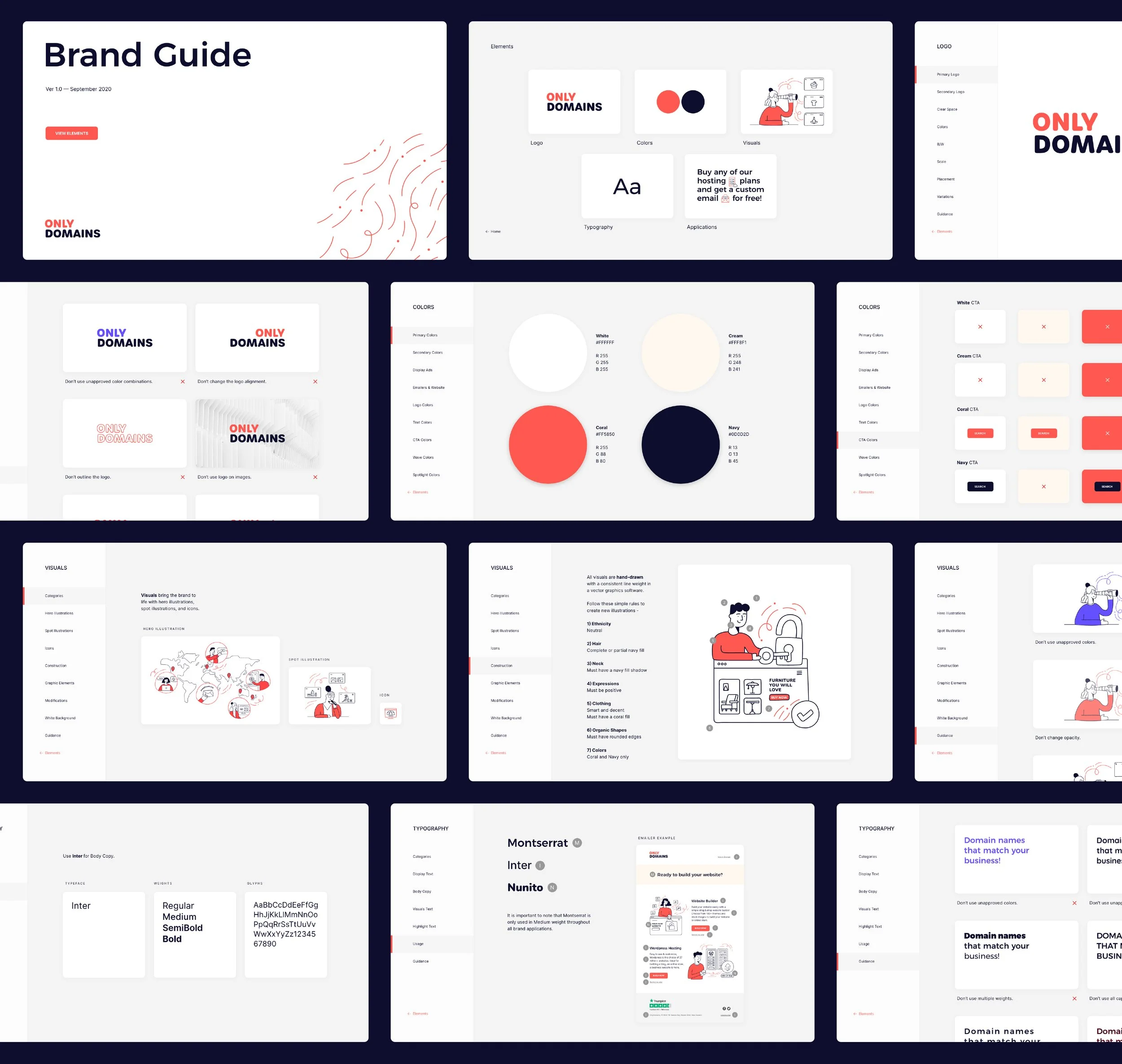
Brand Guide
TEAM
Rigved Sathe (Strategy & Design)
Meroo Seth (Illustrations)
Logo
-

Old Logo
The old logo was poorly constructed and visually inconsistent which reduced legibility and limited use cases. The logomark was borrowed from the ‘power’ symbol which rendered it unownable for the brand. -

New Logo
The new logo was designed keeping its usage in mind. A highly legible wordmark that scales consistently across all sizes and applications. The approach was to create a bold visual identity that emphasizes the brand name. -

Logo Evolution
A snapshot that showcases the transition of the OnlyDomains logo through the years. Interesting to note how we start with the wordmark in 2010 and circle back to it in 2020.


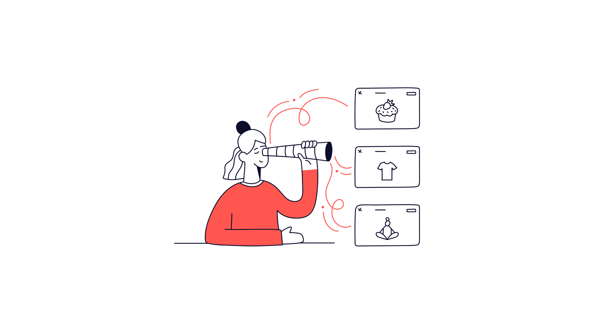
Illustrations
-

Old Illustrations
Old illustrations resembled stock vectors with no guidelines for illustration style or color usage. This led to visual inconsistencies and low brand recall. Most of these were created by different teams across the world without a brand guide. -

Approach
From WiFi, LAN cables to deep sea fibre optic internet cables, these are what make it possible for us to connect to the internet. We used these as an inspiration to create a visually distinct element for the brand called the ‘wave’. -

Creative Direction
Through hand-drawn illustrations, we shifted the focus from their products to their customers. We wanted people to discover themselves through these illustrations and share their sentiments.


Typography
-

x-height
Why look at x-height while choosing a typeface for UI? OnlyDomains website is text heavy and a large x-height translates to higher legibility even at smaller sizes. -

Distinct Letterforms
The characters above are the most common culprits for letterform confusion. It‘s important to choose a typeface for the body copy with distinct letterforms. -
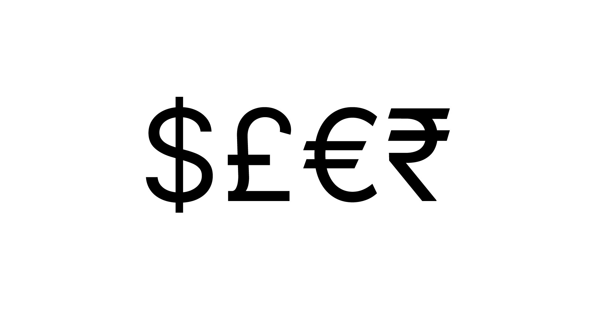
Currency Glyphs
Since OnlyDomains is an e-commerce website with a global presence, it’s important to choose a typeface that supports major currency glyphs.